Creating a Multiple State Navigation Bar- Page TwoAuthor: Kim
Cavanaugh Using the Button Editor (continued)With that minor surgery out of the way, return to the Info area
of the Property inspector to size the object exactly. Set its width
to 100 pixels and its height to 40 pixels.
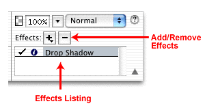
Tip: Set the alignment on any text you use in the Button editor to Center aligned. While you can change the text itself later, you can't change its alignment. Centering the text will give you better and more consistent results. Creating Additional Button StatesCreating the additional button states is a very easy process. Once you have the Up state set the way you like, click on the Over tab. In the bottom of the Button editor you'll see a button that allows you to copy the image from the Up panel onto this new canvas. Click the button labeled Copy Up Graphic and an exact duplicate of the image you designed in the Up panel will be placed on the canvas. For this exercise, return to the Effects area of the Property inspector, seen below, and remove the drop shadow effect by highlighting the effect's name and clicking the minus sign.
Creating the images for the other two button states is done in the same manner. Start by clicking the Down tab, copy the graphic from the previous panel, and make changes to the appearance of the graphic to fit your needs. In the illustration you see here all four button states are displayed. Note that the fill color for the two Down states has been changed to contrast with the Up and Over states. You'll see how this works into the overall navigation scheme in a few minutes.
The final tab at the top of the Button editor is used for checking the active area of the button. Fireworks applies a green overlay on top of the image to help you see where the active area is (this overlay will not appear in the completed graphic) and confines it within guides that define the borders of the slice object. In most cases the area that is automatically applied is fine as it is, but you should check the active area to be certain it fits your needs. If you need to adjust the slice object click and drag the red guides to modify the slice area. You can also select the slice and change its size in the property Inspector. For this exercise be sure that the slice matches the size of the button object by making it 100 pixels wide by 40 pixels high.
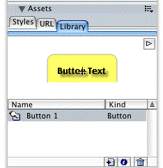
Note: In previous versions of Fireworks the URL and other link properties were also applied in this panel. Those attributes are now assigned in the Property inspector as you will do in a few minutes. Once you are completely finished working in the Button editor click the Done button to close the editor. You'll note that a single instance of the button has been placed on the Fireworks canvas. Also note that the button symbol is listed in the Library section of the Assets panel, as you see here.
|
| « Previous | 1 | 2 | 3 | 4 | Next » |
::This page last modified 8/13/2013 at 04:37::
 |
Copyright
© 2001-2026 DreamweaverFAQ.com All Rights Reserved. All brands, trademarks, tutorials, extensions, code, and articles are the property of their respective owners. A production of Site Drive Inc. Legal Notice | Privacy Policy | Disclaimer & Notice
|
 |


