|
 This
little area actually gives you some good tidbits about your image.
You can name the image, view a small thumbnail, and even take
a look at the file size. This
little area actually gives you some good tidbits about your image.
You can name the image, view a small thumbnail, and even take
a look at the file size.
|
|
 These
are your image map tools. You will have to name the map you want
the image to use, that's what the first box is for. The arrow
is for choosing map slices on your image. The three icons to the
right of it are for actually drawing your hotspots. These
are your image map tools. You will have to name the map you want
the image to use, that's what the first box is for. The arrow
is for choosing map slices on your image. The three icons to the
right of it are for actually drawing your hotspots.
|
|
 This
sets the browser display size of your image. If a size is a different
dimesion than the actual image (be it bigger or smaller), it will
display in bold. Click the H or W will reset that particular dimension
to the image's actual size. You should alway specify your image
sizes, as this will reduce the time it takes for the browser to
draw your page. It's possible to put percentages in here, but
very inadvisable, as browsers don't scale images very well This
sets the browser display size of your image. If a size is a different
dimesion than the actual image (be it bigger or smaller), it will
display in bold. Click the H or W will reset that particular dimension
to the image's actual size. You should alway specify your image
sizes, as this will reduce the time it takes for the browser to
draw your page. It's possible to put percentages in here, but
very inadvisable, as browsers don't scale images very well
|
|

This is the actual location of your image. You can use the
target icon or the browse folder to find your image.
|
|

This adds the <a> tag to your image. If you want your
image to link to another page, this is where you put. Again,
you can use the target icon or the browse folder to find
the page you'd like to link to.
|
|
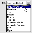
 Using
the image alignment dropdown, you can affect the way text flows
around your image. I recommend sticking to Left, Right, Top and
Bottom, as the rest of the attributes aren't supported in the
XHTML specs, which will eventually replace the HTML specs altogether. Using
the image alignment dropdown, you can affect the way text flows
around your image. I recommend sticking to Left, Right, Top and
Bottom, as the rest of the attributes aren't supported in the
XHTML specs, which will eventually replace the HTML specs altogether.
|
|
 This
allows you to determine where your link will open. If you have
a frameset loaded in your window, this will also show all the
frames names, so you can choose which frame to open the link in. This
allows you to determine where your link will open. If you have
a frameset loaded in your window, this will also show all the
frames names, so you can choose which frame to open the link in.
|
|

This allows you to specify a low resolution image to load
before the main image. I would only use this if you are
showing large high res color images, and want the user to
see something before it completes. Putting a low res grayscale
image here usually works best.
|
|
 You
can use the Vertical and Horizontal space attributes to add some
spacing around your image (similar to spacing in table cells).
These particular settings give your image a 10 pixel space on
each side. You
can use the Vertical and Horizontal space attributes to add some
spacing around your image (similar to spacing in table cells).
These particular settings give your image a 10 pixel space on
each side.
|
|

This is the alt tag for your image. Always complete this
tag for every image. It's required for strict validation,
and is a huge benefit for users with bad vision or images
turned off to speed up web browsing. Don't just say what
the image is. Give a description that could honestly be
some use to someone.
|
|

This is only used if your image is used as a link. Set it
to 0 to prevent a border for showing around your image.
If you *want* a border, you can leave this blank, or fill
in a value.
|
|

This groups of functions can be somewhat misleading. They
align the containing block level element, not the
image itself. So if your image is in a paragraph, and you
click the center button, it will center the paragraph, not
the image.
|
|

If you ask me (and you're gonna have to listen, you're on
my site), this little button alone is worth the upgrade
to the DW/FW4 suite. If you created an image from a png,
and then inserted it into dreamweaver, you can click the
edit button, and it will open the original png in FW, you
can make your edits, and then click Done, and your image
will be re-exported and updated on your page. If you don't
have it, what are you waiting for?
|
|

This button resets your image's height and width to the
actual size of the image. If you mess up the size by accidentally
dragging and dropping a size anchor, or by specifying percentages,
this is the easiest way to make sure you have the image
the right size.
|
Magnum P.I. (Property Inspectors, not Private Investigators)
Author: Daniel
W. Short
Author's Site: Web-Shorts.com
Reference ID: 15615
The Image Inspector
This inspector is jam packed with stuff, so be sure to hit every
part of it. If you're not using version 4 of Dreamweaver or Ultradev,
you won't see the Edit button in the lower right, but I would upgrade
just so I could have that nifty button. Mouse over it to see *why*
it's so nifty.
 The <img> Inspector

|


 Using
the image alignment dropdown, you can affect the way text flows
around your image. I recommend sticking to Left, Right, Top and
Bottom, as the rest of the attributes aren't supported in the
XHTML specs, which will eventually replace the HTML specs altogether.
 This
allows you to determine where your link will open. If you have
a frameset loaded in your window, this will also show all the
frames names, so you can choose which frame to open the link in.
